Window films are one of the easiest ways to change how a Toronto business looks and feels. The right window films can add privacy, sharpen branding, soften harsh glass, and help a storefront or office look more finished from day one. If you run a shop, clinic, salon, studio, office, or restaurant in Toronto and the GTA, you have probably asked the same question many owners ask: which window films make the most sense for my glass?
That question comes up for a reason. A clear front window on Queen Street West does not need the same fix as a boardroom in North York or a treatment room in Markham. Some businesses need privacy. Some need stronger street messaging. Some need both. Decorative film, printed vinyl graphics, and frosted glass film all sit on glass, but they do very diffirent jobs. Picking the wrong one can make a space feel busy, too exposed, or just off. Picking the right one can make the whole front feel smarter.
If you want a broad overview of how window films work for homes and businesses, that is a good place to start before you compare specific options.
In Toronto, this choice also gets shaped by local stuff. Winter slush dirties lower glass fast. Summer sun can make west-facing windows feel harsh late in the day. Sidewalk traffic is close in places like The Junction, Leslieville, and Yonge and Eglinton, so privacy matters more than some owners expect. In office-heavy areas near Bay Street and Union, glass walls look clean and modern, but they can leave staff and clients feeling a bit too visible. That is why this is not just a design choice. It is a use choice.
This guide compares three common options used across Toronto, Scarborough, Etobicoke, Vaughan, Richmond Hill, Brampton, and Mississauga. Decorative window film is usually best for style and light privacy. Printed vinyl graphics are usually best for bold branding and street-facing promos. Frosted glass film is usually best when privacy comes first. The best answer depends on what the glass needs to do every single day.
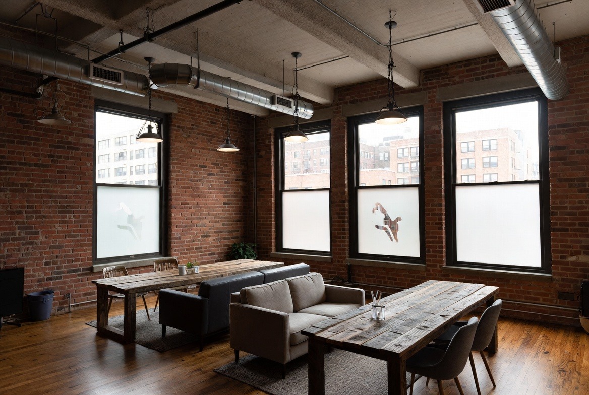
Decorative Window Film
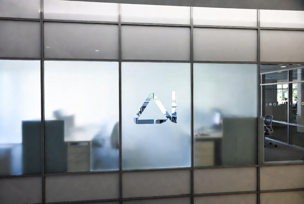
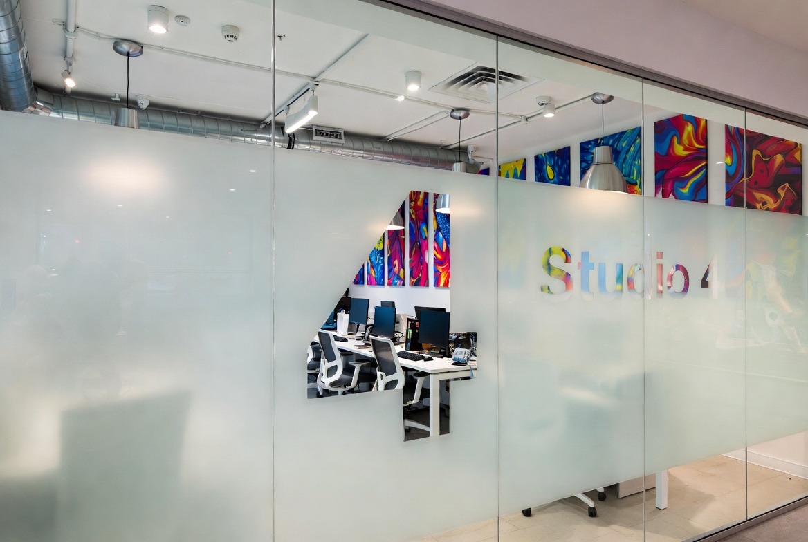
Decorative window film is often the most balanced choice for businesses that want their glass to look polished without killing natural light. It helps a space feel more private, but still open. That is a big reason it is used so much in offices, clinics, salons, wellness spaces, condo lobbies, and service-based storefronts across the GTA.
This kind of film can look like etched glass, dusted glass, frosted bands, gradients, patterns, stripes, or custom shapes. It can also include logos cut into the film. That is why some people ask for logo film when what they really want is decorative film with branding built into it. The nice part is that one install can do two jobs at once. It can improve privacy and make the space look more thought-out.
A small clinic near Yonge and Eglinton is a good example. The owner had clear front glass. Patients in the waiting area felt exposed at night because the interior lights made the room easy to see from outside. The clinic did not want blinds because blinds felt heavy and a bit dated. Decorative film fixed it. A soft frosted band covered the lower part of the glass, and the clinic name was cut through the centre. The room still felt bright. The front looked cleaner. Patients stopped pulling their chairs farther back from the window. Small change, big result.
Decorative film is also useful in offices with lots of interior glass. Boardrooms look nice when the walls are clear, but real life is not a brochure. People notice when every meeting is on display. Staff notice too. A well-placed stripe band or frosted mid-panel can make the room feel more private without taking away the modern glass look. That is one reason this option keeps showing up in downtown offices and shared work spaces.
Another benefit is that decorative film tends to age well. It does not rely on flashy promo text or trend-heavy graphics. It is more about form, spacing, texture, and balance. A good design still looks right months later, even after seasons change. For businesses that want a calmer, more lasting look, that matters alot.
Decorative window film often works best for:
- Boardrooms and office partitions
- Clinic and wellness reception areas
- Glass doors and sidelites
- Studios, salons, and spas
- Storefronts that need some privacy but still want daylight
- Logo film on interior glass
The weak spot is simple. Decorative film does not shout. It supports branding, but it does not sell a seasonal offer or a new menu item the way printed graphics can. If the front window needs to act like a sign first, decorative film may not do enough on its own.
Printed Vinyl Graphics
Printed vinyl graphics are usually the best choice when the glass needs to market the business fast. This is the option for large logos, opening hours, product photos, sale messages, service lists, QR codes, and event promos. Decorative film shapes the feel of a space. Printed graphics shape the message. That is the main difference.
This is why printed graphics are common on restaurants, cafés, gyms, retail shops, dessert spots, event spaces, and service storefronts. If someone walks by and only gives your business two seconds of attention, the glass has to do real work. It has to explain what you sell, who you are, or what is happening right now. Printed graphics can do that much faster than most other window films.
A bakery in Kensington Market gives a good case here. The owner wanted to improve weekday walk-in traffic during slower afternoons. The front window used to be almost empty except for a small logo by the door. The new setup used printed vinyl graphics with a few best-selling pastry photos, store hours, and a short coffee-and-pastry combo promo. The message was easier to read from the sidewalk, and staff said more first-time buyers came in asking for the exact combo they saw on the glass. Thats the kind of result printed graphics are built for.
Printed graphics are also useful when a business changes offers often. A clothing shop in Vaughan may want spring promos, summer clearance, and holiday launches. A restaurant in Scarborough may want lunch specials one month and family platters the next. That kind of change is easier when the glass is treated like campaign space instead of a long-term privacy design.
Still, printed vinyl graphics have weak points too. Privacy is one. Yes, they can block part of the view into a space, but that privacy often feels accidental. It is not as clean or controlled as decorative or frosted film. Another weak point is clutter. Too much text, too many colours, or poor spacing can make a storefront feel messy and cheap. That is not the fault of the material. It is a layout problem. But layout matters more than peopele think.
They can also date faster. A promo that looked fresh in spring can feel stale by late summer. That does not make printed graphics bad. It just means they are better for businesses that need speed, offers, and attention more than timeless visual calm.
Printed vinyl graphics often work best for:
- Retail promotions and sales
- Restaurants and cafés
- Large storefront logos
- Campaigns and seasonal launches
- Businesses that need quick street-level communication
If the main job of the glass is to get attention, printed graphics usually win. If the glass needs to feel better from both inside and outside, decorative or frosted film may fit better.
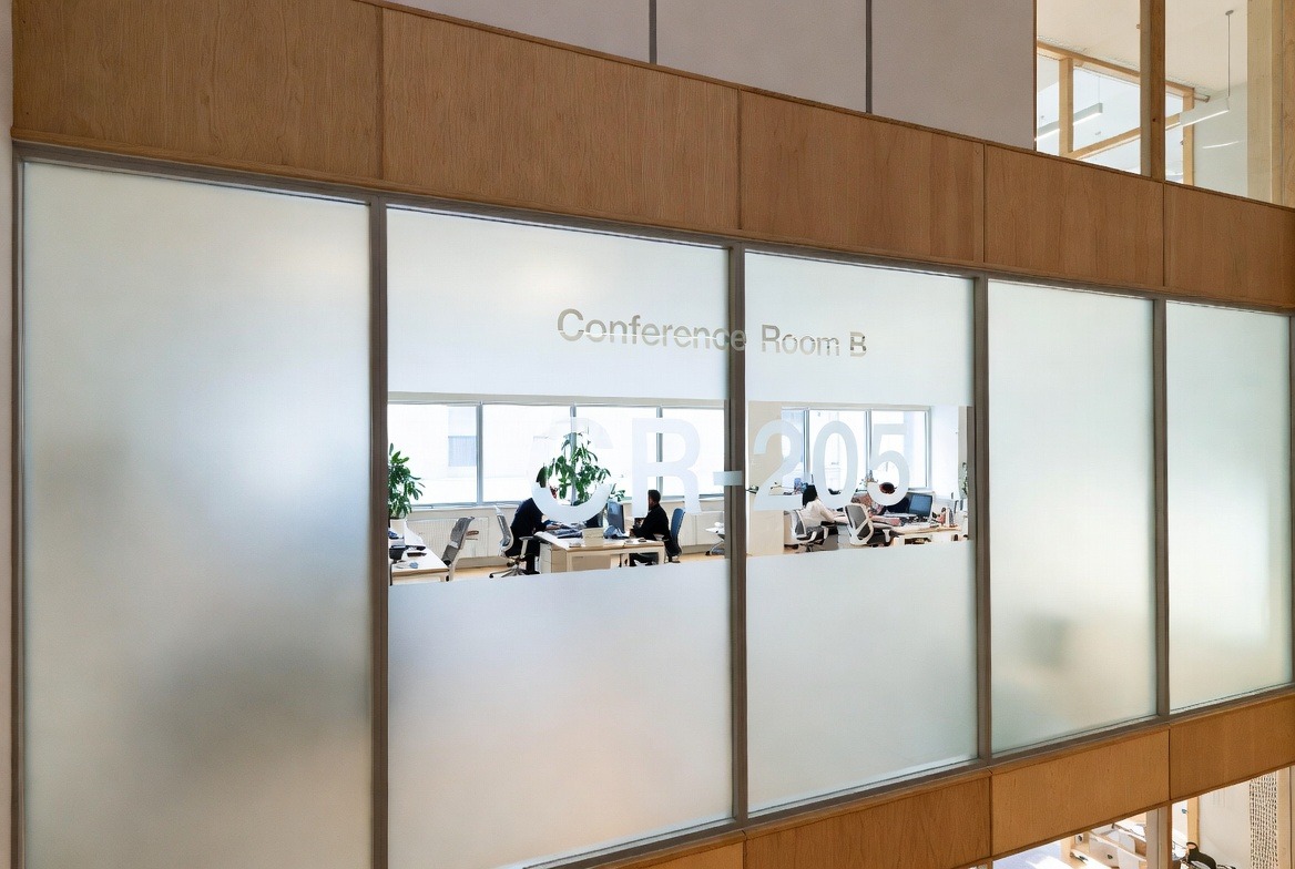
Frosted Glass Film
Frosted glass film is often the best answer when privacy is the main goal. It blocks direct views through the glass while still letting light through. That one trait makes it very useful in clinics, offices, treatment spaces, salons, boardrooms, and street-level service businesses across Toronto and the GTA.
Business owners often start by thinking about blinds or curtains. Then they realise those options can make a room feel darker, older, or more closed in. Frosted glass film solves the visibility problem without making the space heavy. That is why it shows up in so many practical installs. It does the job cleanly.
A small accounting office in Etobicoke is a simple example. The front meeting room had clear glass facing the parking lot and part of the sidewalk. Staff liked the daylight, but clients felt too visible during tax meetings. The office added a frosted mid-band with a small logo detail near the door. That made the room feel more private, but still open. It also hid some of the salt marks and smudges that always show up on lower glass in winter. The space looked more professional right away.
Frosted film is also useful for internal glass in offices and studios. If you have a boardroom, reception desk, or treatment area near a hallway, clear glass can make the whole thing feel awkward. A frosted band or partial panel makes the space easier to use. It also helps people relax. That matters in places where comfort is part of the service.
There is also a local practicality here. In Toronto, the lower section of storefront glass gets dirty fast in the colder months. Slush, salt, boots, and road spray do not care how clean the window looked yesterday. Frosted film on the lower half can hide day-to-day mess better than plain clear glass. In summer, it can also soften the feeling of harsh light, even though it is not the same thing as solar control film.
The U.S. Department of Energy has a good plain-language page on how window coverings help with comfort and glare, which is useful if you want a simple outside source on why glass treatment matters in a space. U.S. Department of Energy: Energy Efficient Window Coverings
Frosted film often works best for:
- Boardrooms
- Reception glass
- Clinics and treatment rooms
- Office partitions and doors
- Street-level service spaces
- Businesses that want privacy without making a room darker
The weak spot is that frosted film is quiet. It can support a logo, yes. It can help the brand feel more polished, yes. But it does not advertise loudly from the street. If you need to sell, promote, or explain what the business does in one fast glance, printed graphics still work harder.
Which Window Films Fit Best in Toronto and the GTA?
If you want the short answer, here it is. Decorative window film is best when you want style, branding, and some privacy. Printed vinyl graphics are best when the glass needs to market the business fast. Frosted glass film is best when privacy is the main job.
That sounds simple, but the right answer still changes by business type and location. A law office in North York may need privacy and a cleaner brand feel. A bakery in Kensington Market may need stronger street messaging. A salon in Richmond Hill may need both branding and light privacy. Same region. Diffirent problem. That is why comparing window films matters so much.
Toronto also has a strong main-street business culture. The City of Toronto’s BIA page is a good reminder of how many local shopping and service areas depend on curb appeal, readable storefronts, and useful glass. City of Toronto: Business Improvement Areas
For most business owners, four questions make the choice easier:
- Do people need to see in, or not?
- Does the glass need to sell, or just support the brand?
- Do staff and clients need more privacy inside?
- Will this still look right next season?
Good window films are not just about the material. Design matters. Spacing matters. Cut lines matter. Install quality matters too. A bad layout can waste good film. A smart layout can make a simple film work much harder. That is why owners in Toronto, Etobicoke, Scarborough, Markham, Vaughan, Richmond Hill, Brampton, and Mississauga keep asking the same thing in diffirent ways: what should the glass actually do?
Once that answer is clear, the film choice gets a lot easier. And when the film matches the real job of the glass, the space usually looks better, feels better, and works better too.