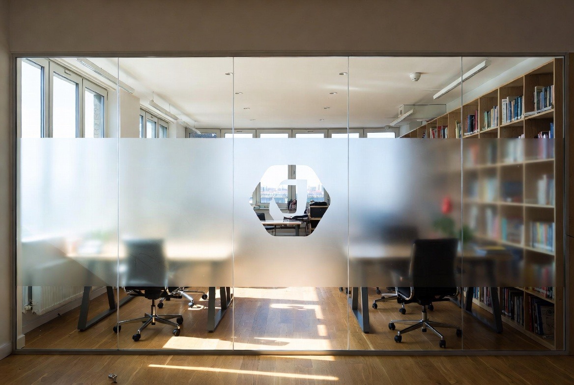
Window films help retail stores in Toronto and the GTA turn plain glass into branding space that works harder. Good window films can show your logo, add privacy, support wayfinding, and make your storefront easier to read from the street. For many local shops, that first look matters more than people think. Before someone checks your website, reads a review, or talks to staff, they see the glass.
That is why more businesses use window films as part of storefront branding. A smart film plan can help a shop look cleaner, more settled, and more useful to passing foot traffic. It can also help with real problems, like too much exposure near the front counter, a blank-looking window, or a door that does not stand out enough.
In Toronto, that matters alot. Stores on Queen Street West, the Danforth, Bloor West Village, Yorkville, Leslieville, and in plaza areas across Vaughan, Richmond Hill, Markham, Brampton, and Mississauga all fight for quick attention. People walk by fast. People drive by fast. They compare businesses in a few seconds. If the front glass looks clear and on-brand, the store has a better shot at getting noticed.
This guide explains what retail branding with window films really means, how different film types help storefronts, and how to choose the right setup without making the glass feel too busy, too dark, or too random.
Why window films matter so much on a retail storefront
Retail branding with window films means using film on glass to support the look, message, and function of the business. That can mean a logo on the door. It can mean frosted privacy film at the lower half of the window. It can mean a printed graphic that shows what you sell. It can also mean a simple design pattern that helps the storefront feel more polished.
The key idea is simple. The glass should do more than just sit there. For a shop, the front window is one of the first things people notice. If it looks blank, cluttered, or hard to read, the business may feel less organised. If it looks sharp and easy to understand, the business feels stronger right away.
That is not just a design issue. It is a customer issue. Most people do not stop and study a storefront. They scan it. They ask a few quick questions in their head:
- What kind of business is this?
- Does it look clean and trust-worthy?
- Do I feel like going in?
Window films help answer those questions faster. A clear logo film on the door tells people they are in the right place. A printed panel can explain the service in a few words. A frosted band can make a clinic or beauty studio feel more private. These are small moves, but they change how the whole space reads.
This matters even more in local shopping areas where stores sit close together. Toronto’s business improvement areas put a lot of focus on shopping streets, storefront quality, and neighbourhood business districts. You can see how the city supports those local retail zones on the City of Toronto BIA page. In plain terms, better storefronts help whole strips feel more active, and weak storefronts can get lost fast.
Local context changes the job too. A fashion boutique in Yorkville may want a cleaner, more minimal look with more open glass. A phone repair shop in Scarborough may need bigger wording that reads from farther away. A café near Trinity Bellwoods may want branding that still leaves room to see the warm atmosphere inside. A service business in a Vaughan plaza may care more about fast readability from the parking lot than tiny details at eye level.
Season matters as well. In winter, early sunset and dirty slush near the curb can make storefronts feel dull by late afternoon. In summer, west-facing glass can get strong glare. During back-to-school season, holiday shopping, and spring sidewalk traffic, the front of the store often gets extra attention. Good window films can help the business still feel clear through all of that, not just on a sunny day in perfect light.
That is why the best retail window films are not just “nice graphics.” They help the front of the business attract, explain, guide, and reassure. They support the real job of the storefront.
How printed film, privacy film, and logo film work together
Most retail branding jobs use a mix of three common film types. These are printed film, privacy or decorative film, and logo film. They sound similar, but they solve differrent problems.
Printed film is often the main message piece. It can show product photos, sale notices, brand colours, service wording, or a short line that explains what the store does. If the storefront needs more impact from the street, printed film usually does the heavy lifting.
Privacy or decorative film is more about comfort and finish. Frosted film, etched-look film, bands, stripes, and subtle patterns fit in this group. These films help when a business wants to block certain views without killing all the daylight. Salons, clinics, spas, treatment studios, and cafés often use this type near front seating, reception desks, or service zones.
Logo film is the clean closer. It is often placed on the entrance door or side glass near the entrance. It can include the logo, store hours, website, or a short brand line. It may be smaller than the other film elements, but it can make a big differrence. A clean logo on the door makes the entrance feel more complete and more proffesional.
The reason these types work well together is simple. Most storefronts need more than one result from the glass. They need attention, privacy, and brand clarity at the same time. One film type alone may not do all of that well.
Here is one example. A small bakery in East York had a nice product display inside, but the front glass felt too plain from the sidewalk. The owner first thought about covering both large panes with printed graphics. That would have been too much. It would block the view of the pastries, which were already a selling point. A better answer was one side panel with printed brand art, a clean logo on the door, and a narrow frosted strip near the lower seating area. The store stayed open and bright, but the front looked more put together.
Here is another case. A wellness studio in Richmond Hill had a reception area right against the front glass. New clients felt awkward because people outside could see them sitting there. The first idea was dark film across the full window. That would have made the space feel closed in. The better move was a frosted privacy band at seated eye level, simple service wording above it, and a logo film on the entrance. The result gave privacy without making the storefront heavy.
Those two cases show a useful pattern. Window films should solve a real storefront problem. They should not just “fill space.” If the design blocks the best parts of the business, it is the wrong design. If it helps people understand the store faster, then it is doing its job.
Good retail window films often aim to do these things:
- Show what the business is in a few seconds
- Make the entrance easier to spot
- Add privacy where people need it
- Support the brand colours and style
- Keep enough open glass for light and visibility
That last point matters more than many owners expect. Open glass can be useful. It shows movement inside. It frames the branding. It keeps the storefront from feeling too crowded. In many cases, partial coverage works better than full coverage.
How to plan retail window films without wasting money
The biggest mistake many owners make is choosing the style before choosing the goal. They say they want something bold, modern, or full coverage. Those are design ideas, but they are not business goals. The better question is this: what should the glass do for the store?
That answer changes everything. A store that feels invisible may need stronger printed film. A clinic that feels exposed may need more privacy film. A shop that already has great foot traffic may only need a better entrance with a sharp logo film layout and clear hours.
A simple planning list helps:
- What should people notice first?
- What should they understand before they walk in?
- How much of the interior should stay visible?
- Which parts of the glass get harsh afternoon sun?
- Is the branding meant to stay long term or change with seasons?
- Does the glass design match the website, menus, signs, and packaging?
Once those answers are clear, the layout gets easier. Many strong storefronts use three layers. The first is the brand layer, which includes the logo, colours, and visual tone. The second is the message layer, which explains what the business offers. The third is the function layer, which handles privacy, light, glare, and visibility. When those layers line up, the storefront feels easy to read. When they fight each other, the glass looks messy fast.
Placement matters just as much as the film itself. Some owners want every inch of glass covered because they feel the whole window should “work.” That idea often leads to clutter. Open sections matter. They can show the interior, keep the front from feeling boxed in, and let the eye rest. Too much copy, too many colours, or too much coverage can make a business feel cheaper, even if the brand itself is good.
Viewing distance matters too. A busy downtown storefront that gets close foot traffic can sometimes use smaller details. A suburban plaza unit needs stronger shapes and fewer words because many people first see it from a car or across a parking lot. That is one reason a design that looks nice on a computer screen may fail on actual glass.
Movement patterns matter in Toronto as well. Stores near subway stations, streetcar routes, and busy bus stops get very fast views from passersby. The TTC’s official operating stats page is a useful reminder of how much daily motion storefronts sit beside in this city: TTC annual boardings. That does not mean every store gets the same traffic, of course, but it shows why quick readability matters so much here.
Installer quality also matters alot. Good film with weak trimming, crooked placement, or bubbling edges still looks bad. A solid installer should think about door handles, mullions, sightlines, sunlight, and how the message reads from differrent angles. They should also help you avoid placing important text too low, too high, or too small.
For owners with more than one location in the GTA, consistency matters as well. A downtown Toronto unit and a plaza store in Brampton may need differrent layouts because the glass and traffic patterns are not the same. But the brand should still feel connected. Same logo tone. Same colour system. Same message style. That helps the business feel more stable and more easy to remember.
Why storefront window films help local businesses stand out
Retail branding with window films works because it improves one of the first things customers see. It helps the glass do more than sit there. It helps the storefront explain itself, support the brand, and make people feel more sure about stepping inside.
That is useful for almost any small or mid-sized shop. It can help a boutique look more polished. It can help a café keep some privacy near the front. It can help a service business make its entrance clearer. It can help a clinic feel less exposed. It can even help a strong store that already has good traffic look more complete from the street.
The best results usually come from a simple approach. Clear message. Strong entrance. Enough privacy where needed. Enough open glass where it helps. That balance is what makes window films work well on retail storefronts.
If your front window feels blank, cluttered, too exposed, or just hard to understand, that is often the first place worth fixing. Good window films can make the storefront easier to read, easier to trust, and easier to remember. In Toronto and the GTA, where first impressions happen fast and local competition is close, that can make a real differrence.
Leave a Reply